Documentation
Browse and explore docs
Switching and Migrating Visual Styles
Shadcn Dashboard supports multiple visual styles. These styles define the layout spacing, border-radii, and design tokens of your components. You can instantly change the style of your project using the shadcn CLI preset commands.
1. Style Presets Overview
Each style maps to a specific shadcn preset ID:
| Style Name | Preset ID | Aesthetic Description |
|---|---|---|
| Vega | bIkeymG | Clean, neutral, familiar shadcn/ui look. |
| Nova | b0 | Compact data-heavy layout with reduced padding and margins. |
| Maia | bbVJxYW | Soft, rounded corners with generous spacing and curves. |
| Lyra | buFywKm | Boxy, sharp, completely flat corners. Pairs well with mono fonts. |
| Mira | b1D0dv72 | Ultra-compact. Engineered for dense professional interfaces. |
| Luma | b1VlIttI | Fluid, luminous, and soft curves. |
| Rhea | b27GcrRo | Like Luma but compact. |
2. Apply Style Theme to Your Project
Run the following command in your terminal using your preferred package manager to update your color, radius, and shadow tokens.
3. Example: Applying Lyra Style
To apply the boxy, sharp Lyra style (Preset ID: buFywKm) to your project, run:
4. How to Preview Styles on Our Site
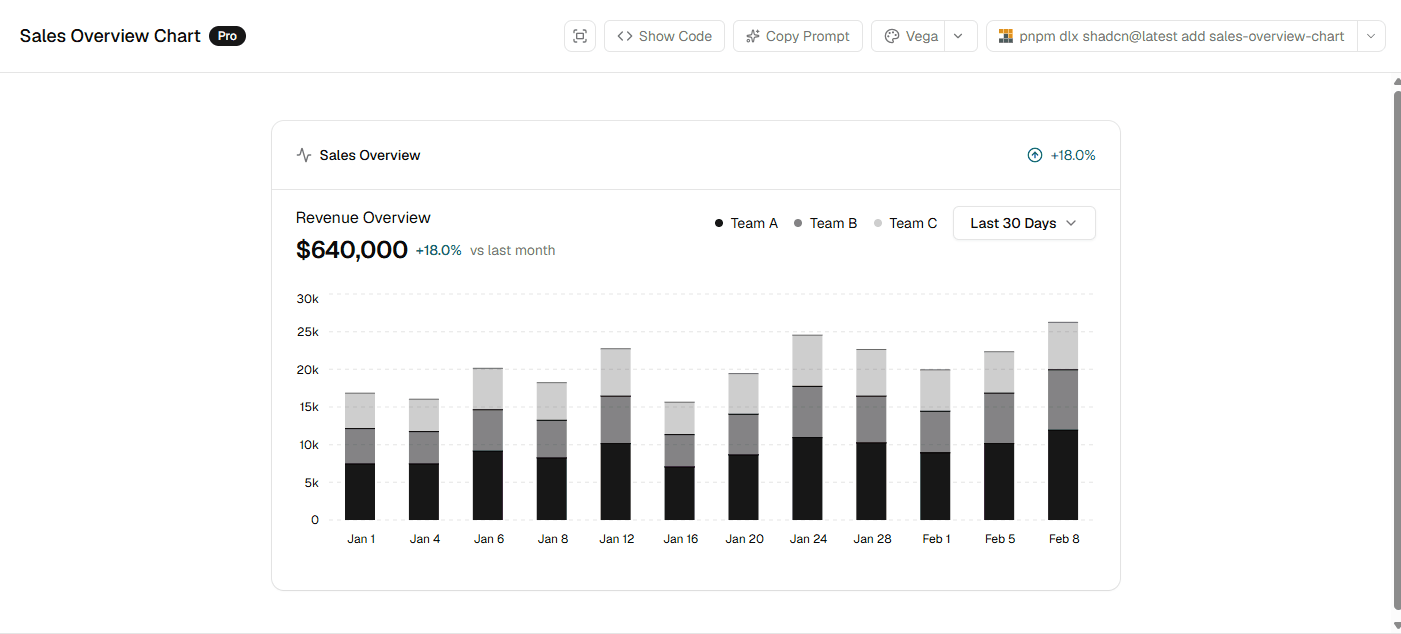
Every block and dashboard preview on our website comes with an interactive style selector. You can switch between different styles (Vega, Lyra, Maia, etc.) directly from the block viewer interface to see the layout adjust in real-time.
Simply click on the style switcher in the header of the block card to change the preview, select your package manager, and instantly copy the preset command:
Style-Specific CSS Class Overrides
If you want to customize how components render specifically under a certain style, you can use custom style variants like style-lyra:rounded-none, or add custom overrides in your layout stylesheets scoped under classes such as .style-lyra.